
Cheyenne Mountain Zoo Rebrand
Context: Graduate individual project
Role: User experience designer, researcher
Timeline: 4 months (January - April)
Tools: Figma
Goal: Non-member ticket purchase user flow
Overview
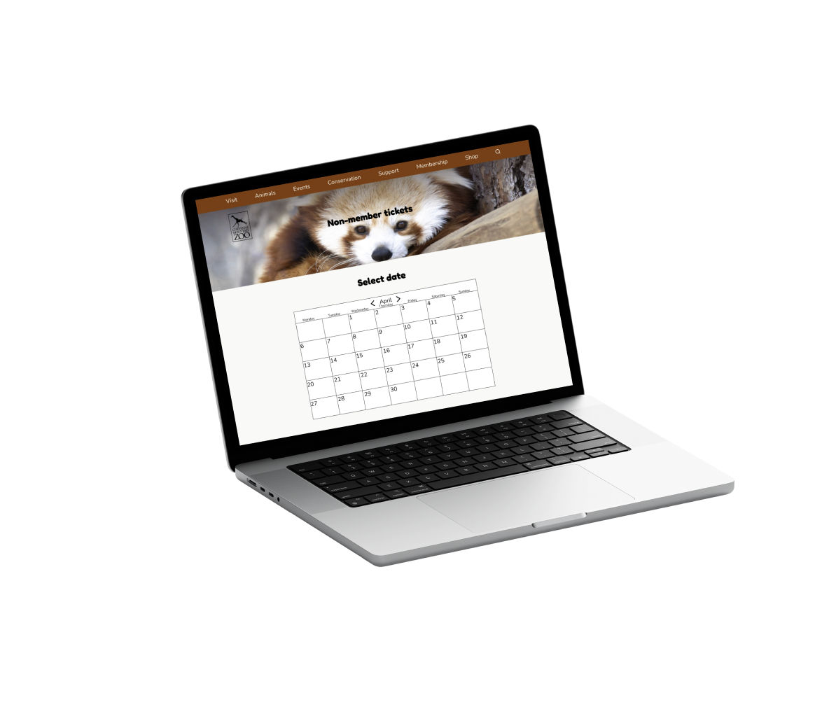
The Cheyenne Mountain Zoo rebrand takes the current website design and gives it a new user flow and aesthetic design based on user testing feedback. The aim is to improve the user flow to purchase non-member tickets. This is important because improving the site design based on feedback improves the time and efficiency of purchasing tickets and can therefore improve ticket sales. The result is a more user-friendly site, achieved by enhancing the clarity and intuitiveness of its interface and navigation.
My role in this project was user experience designer and researcher, in which I conducted user experience research, synthesized the information to find pain points to address in the redesign, and implemented a redesign with a new user flow for purchasing tickets.
For the Cheyenne Mountain Zoo website, the challenge addressed was the usability issues in the ticket purchase flow, in other words improving how convoluted the ticket purchasing process currently is. This included overload of text, too many pages and steps, and complexity of design to choose date and time. The limitations included balancing necessary information and keeping the pages and text limited.
Research
Usability testing
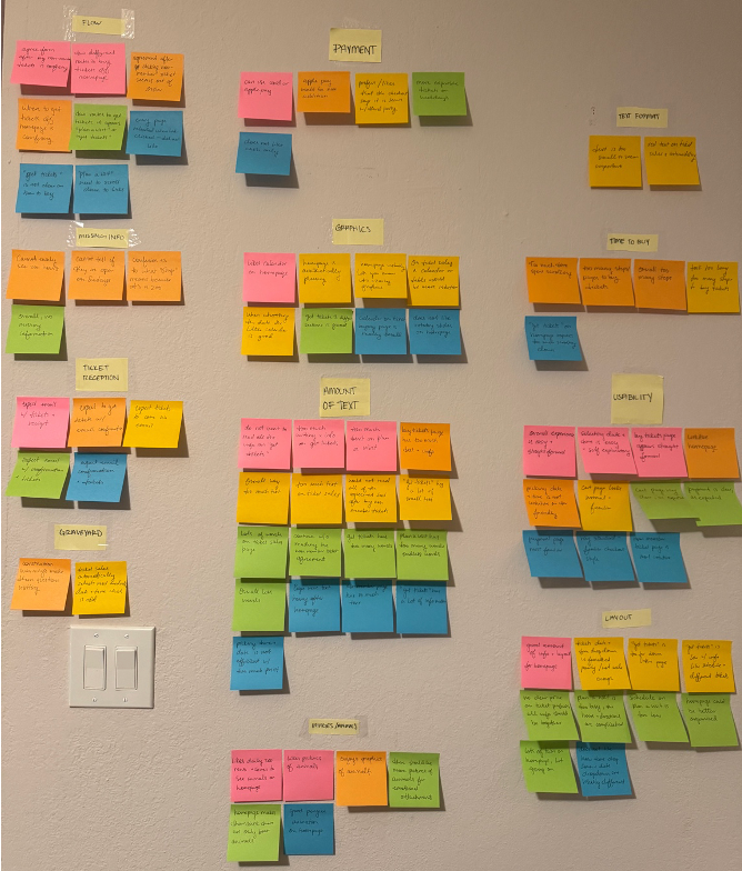
To collect research on the flow of the site I carried out 5 usability tests in which people between ages 18-65 who have made an online purchase and visited a zoo before, were led through the site and asked questions about what they were doing. From these affinity maps were created to locate the common areas of issues and specific pain points
Affinity mapping
Next, using the statements made by users, common areas of issues were identified and grouped together. From this, the most common pain points were identified by tallying the most commented on issues. (See right)
How might we statements
From the pain points identified "how might we" statements were created to prompt finding an opportunity for improvement. For example:
How might we simplify text-based information and emphasize only important text, for users, to ensure clarity of necessary information.
Design
Problem statement
Cheyenne Mountain Zoo ticket purchasers need a clear and concise path to buy tickets in order to ensure a quick and uncomplicated process that does not deter users.
Task flow
To determine the task flow I used the usability testing and results from affinity mapping to determine what pages and information are necessary and needs to stay included and what may be omitted. This task flow reflects a design that minimizes pages the user is taken to. This task flow aims to reduce steps the user takes, improve conciseness, and give a more direct path.

Low fidelity wireframes
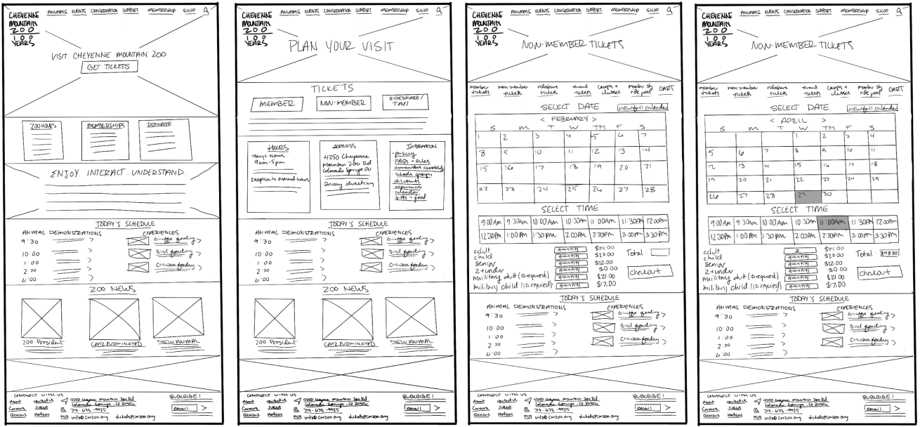
For low fidelity wireframes I sketched the design of the each page in Procreate. I identified the sections of information that are most pertinent to the user and to purchasing a non-member ticket. The main goal here was to decrease the number of pages needed than what is currently present on the site. I also only included large headers and necessary information, the less pertinent information is not specified yet.
Mid fidelity wireframes
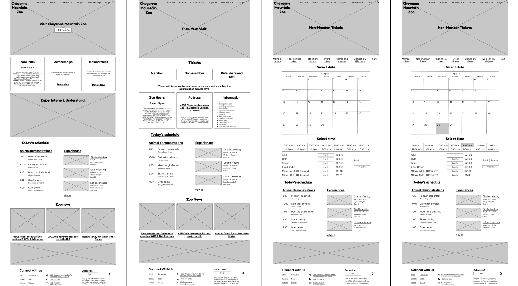
For the mid fidelity wireframes I translated the sketches in the previous step to Figma. Here, the design is recreated with UI standards, especially vertical spacing in increments of 8px, placing components on grids, and using standard mid fidelity component design. The focus here is placements and sizing of components rather than branding.
High fidelity interactive prototype
As a part of the high fidelity prototype, I first determined the branding elements of the Cheyenne Mountain Zoo. This includes the color, icons, fonts, and images. Then, the color, fonts, and images are filled in the prototype. The goal here is to abide by UI standards including proportioning of the colors and color contrasts.
Instructor feedback
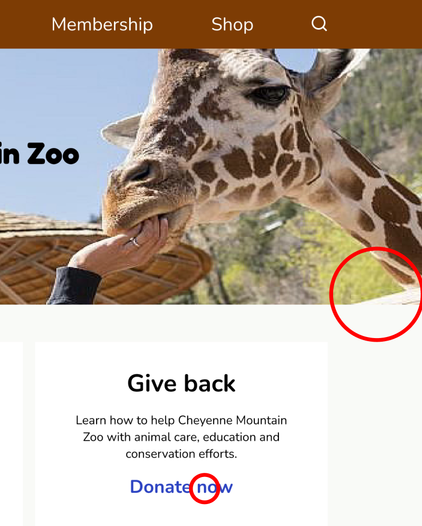
The instructor gave feedback after an initial high fidelity prototype which included extending the background image and header and the footer, only having one action button per page, and using sentence case. Based on these comments I rechecked all type for sentence case, extended all necessary items in header and footer, and minimized all buttons per page to 1.
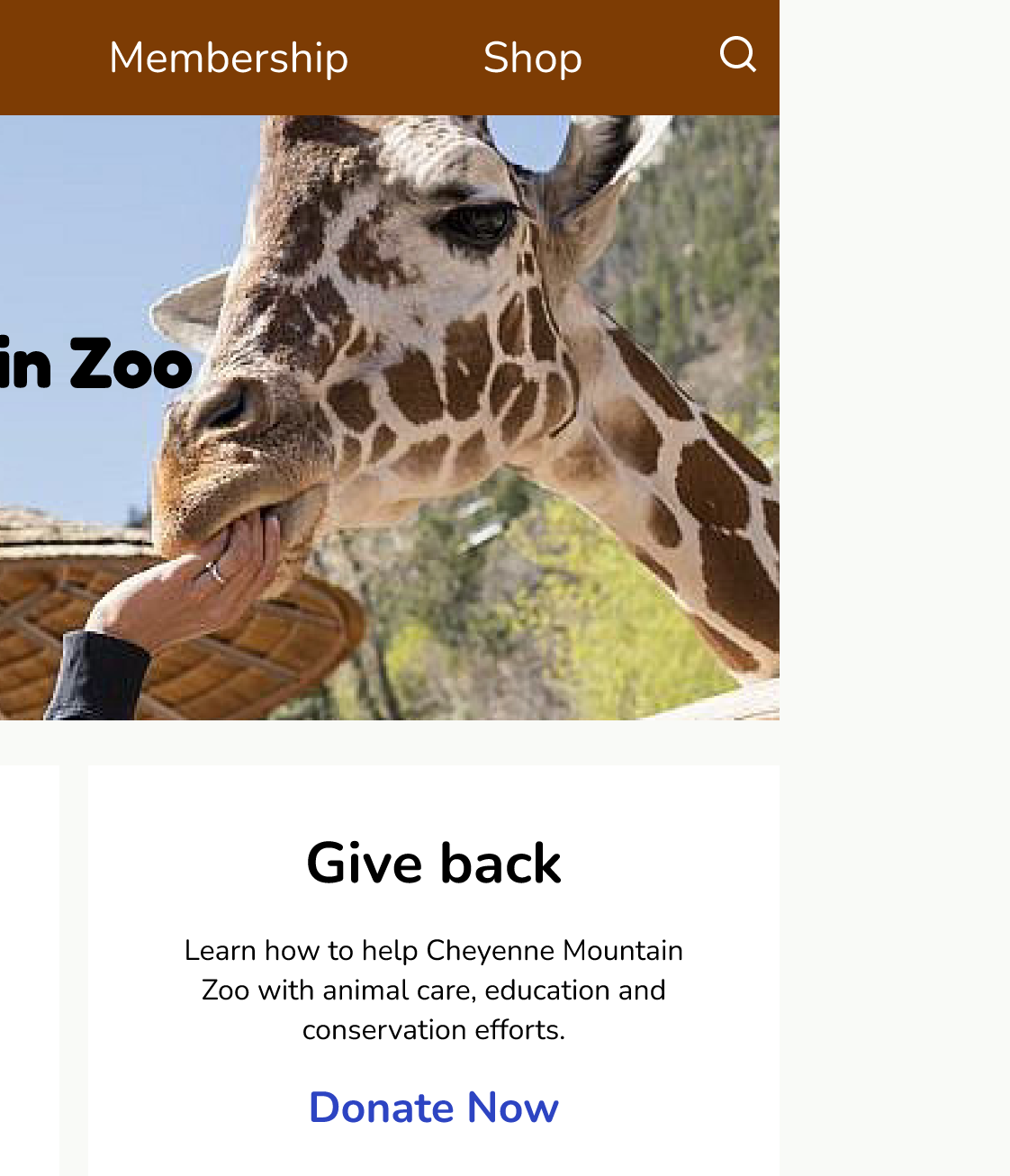
Prototype 1
Prototype 2
Evaluation and results
User testing and pain points
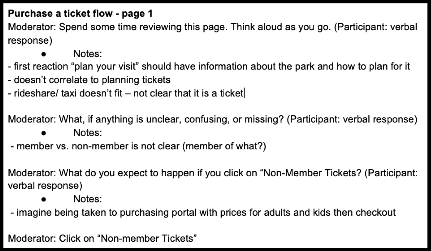
To conduct user tests I carried out three in person tests, from people of the same demographic as the initial usability tests, guiding them through the process of purchasing a non-member ticket. From these results I gathered repeated pain points that the users identified in the tests. These pain points included confusion in the differences of buttons such as "visit" and "get tickets," too much dense information, and component sizes, such as the calendar.
Updates
To remedy the pain points identified by the user tests I first identified areas with dense texts and determined what was necessary and what can be removed. To reduce confusion, I made the "Visit" tab a different path than "Get tickets" and then enlarged the "Get tickets" button to draw more attention. Lastly, I adjusted the size of the calendar and increased the space between components to reduce a squished feeling.
Reflections
Future plans
My next steps in the redesign would be to make all of the links on the pages in the flow clickable to make it more realistic. I would also use updated images of the zoo for the site. I wanted to use images from the actual zoo but there was not great quality available online. Lastly, I would probably add to the prototype the flow of minor features such as interactivity in the calendar and update daily information to change accordingly.
Conclusions
My biggest takeaways from this redesign were being detailed in the mid fidelity prototype and the importance of user testing. I found that the more exact with placement and spaces I was in the mid fidelity, the less work I did in the high fidelity. When the mid fidelity is detailed and exact, the high fidelity prototype allows you to just drop in images, fonts, and color. My other big takeaway was the user testing is very important in finding remaining confusion in the user flow. This way, I found pain points I did not even consider during design. The biggest lesson I learned was to be patient in taking time to check all vertical distances, grid alignments, and sizing. I also learned that patience allows for more careful designing and less mistakes made.